Data Visualisation 2021 Blog Series Part 2 — Comparison is the thief of joy
In the not so distant past, connecting to data and creating reports / visualising data required heavy input from IT. The end result was usually incredibly static, with underwhelming reports / dashboards. Happily, tools like Tableau and Power BI have transformed the landscape, and great data viz is easier to achieve than ever before.
Four things, in my opinion, broadly make a good visualisation tool:
1 — Ease of use. These days all that is required is a single simple install file that once installed allows users to connect to data and visualise in seconds. The visualisations created are highly customisable allowing the user to create, explore and innovate.
2 — Beauty of outputs. At the core, these are visualisation products, therefore the tool must be able to create something that the end user finds beautiful, professional and engaging. Not only with how the visualisation looks, but in the way the user can interact with, and investigate the data.
3 — Depth of functionality. The list of functionality needs to extend way beyond being able to take data from a source and making a visualisation. It needs to be enterprise-ready so that content can be shared widely across the organisation. In order to do this, you need to be able to set up Single Sign On, and apply row level security. The user can’t be limited to where their data is held, so these tools can connect to a wide range of sources including databases, text files, excel, web connections etc. The market leaders provide the ability to join and transform the data within the tool itself so you can join an Excel Spreadsheet to a big Oracle database, if you wish, without the need for a database developer to do any work for you. Although, just because you can, it doesn’t mean you should.
4 — Inspiring community. You only have to visit the Power BI and Tableau forums to see how passionate people are about these products. The community helps the product grow and teach people how to use these tools properly.
Tableau and Power BI have these in abundance, and that is why they are market leaders. However, they have multiple solutions at varying prices. The less you pay, the less depth of functionality you get. So I will go through each of their solutions and give an overview as to what you get for each.
We have discussed in part one of the series the different products on offer. Here, we focus on the advantages and disadvantages of the core visualisation products — Tableau Desktop (Tableau Creator) and Power BI Pro.
Tableau
Advantages
- Extremely easy calculation syntax
- Unlimited data points on visualisation
- Handles vast amount of data with no limits on size or refreshes
- TabPy allows you to seamlessly integrate Python in Tableau.
- For complexed statistical analysis — integration with R
- Group categories on the fly and cut the data with unlimited categories allowing to drill down to raw level data
- Use parameters to change values and perform “what if” analysis
- Out the box forecasting / trend analysis models
- Story Points
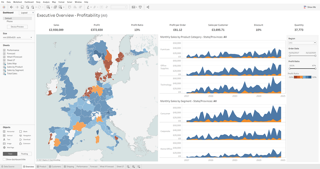
- Pages functionality. Animated visualisations e.g. See a Hans Rosling style visualisation.
- Extremely customisable point and filled maps
Disadvantages
- Formatting is tricky. It can get extremely fiddly when creating dashboards. The use of layout containers (floating or tiled) takes some getting used to.
- Steeper learning curve to use the tool well
- Expensive for an individual
- Separate tool (Prep) for transforming data
- Natural Language tool “Ask Data” only in the Enterprise version
Power BI
Advantages
- Very easily create / format dashboards
- Integrated tool for transforming data
- Pre-built visualisation created by the community that can be accessed on an open platform
- Cheap for an individual
- Integration with other Microsoft products
- Less of a steep learning curve
- Natural Language Tool integrated in Pro
Disadvantages
- Limits the number of data points to 3500
- Can’t handle vast data — limits on size and refreshes
- Can’t cut the data by more than two categories.
- Some features depend on if data is live or in-memory
Key Differences?
Comparing these tools is difficult, as they have a lot of similarities. Both tools are extremely powerful and can create beautiful visualisations with little to no coding or technical know-how required.
That being said, there are key high level differences between the two.
Power BI is focussed to a general audience who want to create reports. As mentioned in the advantage section, there are lots of pre-built visualisations that you can access in Power BI, but creating your own custom visualisations is not easy and requires coding. This means that, generally speaking, the process to visualise is generally to select your data items, select your chart and format your dashboard.
In Tableau you can really easily do two things very well:
1 — Data exploration and
2 — Custom visualisation.
This allows you to investigate and understand your data. Innovate and experiment with the data to find the insights and experiment with different visualisations to see which one tells the story best / highlights the insights in the most effective way. This method of visualising does move Tableau away from a more general audience, and targets it to analysts who want to be more involved / closer with the data.
Even though you can share the custom visualisations you create in Tableau via Tableau public, they are attached to your data set. The “Show Me” option in Tableau is a list of visualisations pre-built, like Power BI. Unlike Power BI though, they are created by the developers, not the community, and so they are a black box, and you can’t contribute to it.
It is incredibly easy to become biased towards one tool if you have been using it for years, so if you have someone tell you with certainty X is better than Y — take it with a pinch of salt.
In part 3 of this series we will wrap up and discuss a few additional considerations when beginning your Data Visualisation journey.